Moritz
Sans
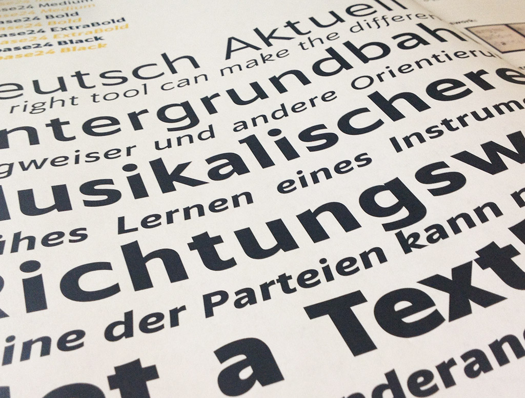
Moritz Sans is a modern humanist sans, developed as a web-font designed for easy comprehension, and to be read even in the smallest text- sizes.
Thin
128px
normal
Aren’t you putting a lot of stress on the load-bearing grid
Regular
128px
italic
The edge of the ocean, where we can start over again
Medium
128px
normal
Shed our skin, let the sun shine in
Bold
128px
normal
Lost in a memory, I’m falling back in time.
Extra Bold
128px
italic
Can’t cook with fire if you’re not right with the world
Black
128px
normal
There will be an additional charge for extra condiments
About
Moritz Sans was conceptualized as a font for a language-learning website. The site was originally set in Verdana during development, and it worked beautifully well: Being a very wide and easily legible typeface, it was the ideal choice for a website about learning and comprehending a new language through text. You really want a font that not just gets out of the way of the reader, but is a silent supporter.
Origins & Opportunities
This was the perfect opportunity to do something I had wanted to do for a long time: designing a sans serif typeface based on an existing serif font. Ever since learning about the history of the Deutsche Bahn typeface (christianschwartz.com), had long been wanting to base a sans on arguably most ubiquitous Serif there is: Times New Roman. But after the first few sketches I quickly realized that, while the resulting typeface had potential, it didn’t meet one of the key requirements we wanted: To be wide. After a quick search through the other basics, I landed on Palatino, which does run beautifully wide, and is a very pretty and legible serif.
Shapes and legibility
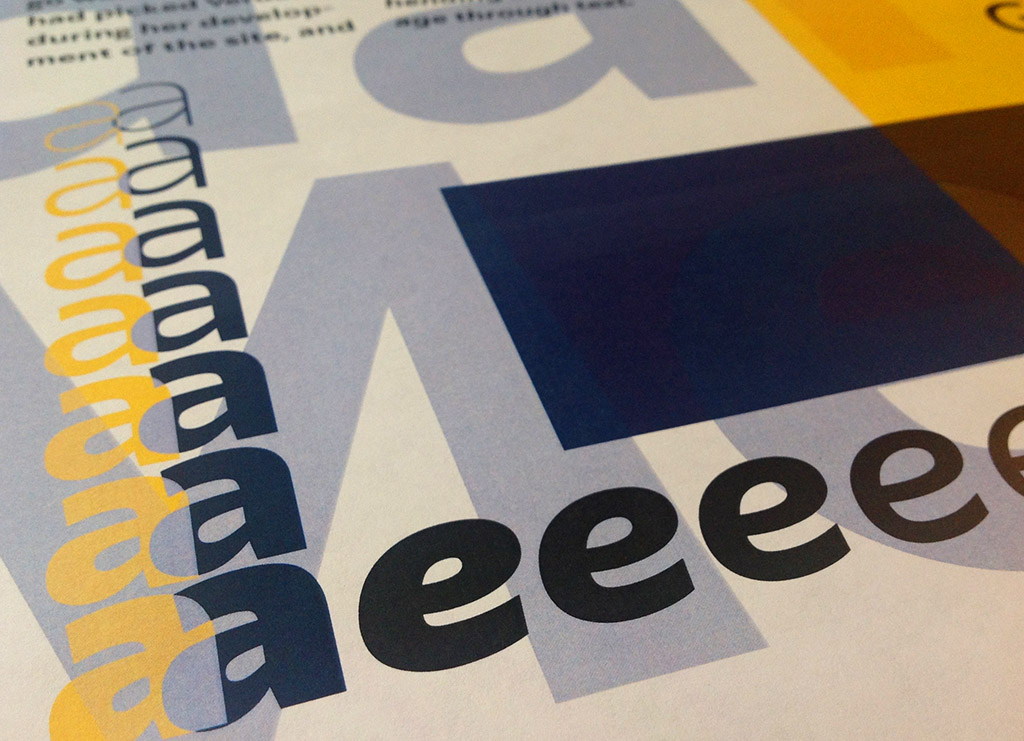
One of the other factors in choosing to make a Palatino-based sans was that it differentiates greater between the individual letter shapes than most modern typfaces do. This was very important to have in a typeface meant for reading, learning.
Even though the letters all face in different directions, a b is quite easily mistaken as a p, b and q, especially if you’re leaning towards dyslexia.
Further, an l cannot look like a 1 or I, an 8 should not look like a B or ß, and rn may not run together into read as an m. To achieve this, each letter has – subtly, but noticeably – their own distinct and unique shape and forms.
Capital
For the capital letters I wanted something a little bit more clean and German – technical, if you will. I based the Capitals on my own Neue Mogobau typeface, which itself is inspired by the Futura model. I made the shapes quite a bit wider and more open, to match the minuscule letters.
The final product
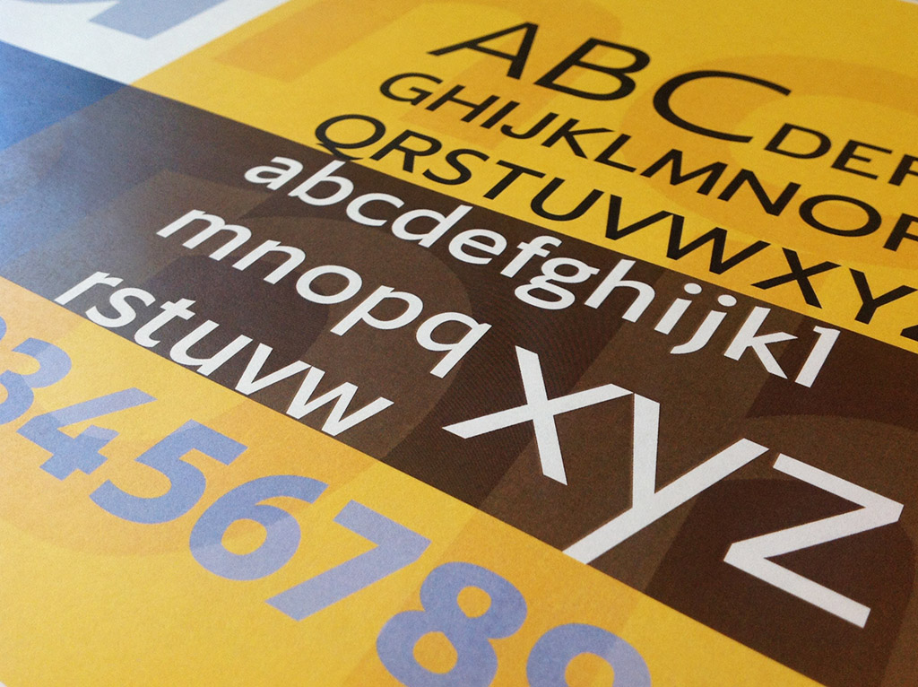
Wide, with lots of room, generous spacing and a larger, just-right x-height, and easily distinguished individual letter shapes, Moritz Sans is a great typeface for reading and learning.
It also comes with a beautiful italic.
Stylistic alternates
Moritz Sans’s comes with stylistic alternates that add even more legible shapes to some letters, and flips the italic/normal g/g split.
Alternate Set 1, for small text, With extra details to letters like r, and a more clear differentiation of l and I.
Set 1 thin
96px
normal
Isla sorna lorem ipsum dolor sit
Set 1 Extra Light
96px
italic
Learn and run list prices are to be found demand
Alternate Set 2 swaps the g shapes: The normal font has a 2 story g, with the italic being single. This set reverses that.
Set 2 semi-bold
96px
italic
Giggle cream. It makes dessert funny!
Set 2 regular
96px
italic
Baggage griding gruntingly down the chute
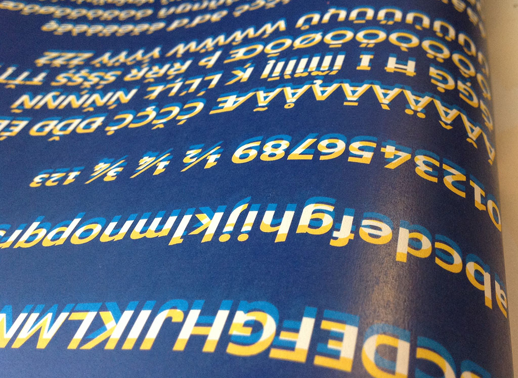
Character set
!
!"
“#
#$
$%
%&
&'
‘(
()
)*
*+
+,
,-
–.
./
/0
01
12
23
34
45
56
67
78
89
9:
:;
;<
<=
=>
>?
?@
@A
AB
BC
CD
DE
EF
FG
GH
HI
IJ
JK
KL
LM
MN
NO
OP
PQ
QR
RS
ST
TU
UV
VW
WX
XY
YZ
Z[
[\
\]
]^
^_
_`
`a
ab
bc
cd
de
ef
fg
gh
hi
ij
jk
kl
lm
mn
no
op
pq
qr
rs
st
tu
uv
vw
wx
xy
yz
z{
{|
|}
}~
~¡
¡¢
¢£
£¤
¤¥
¥¦
¦§
§¨
¨©
©ª
ª«
«¬
¨
®¯
¯°
°±
±²
²³
³´
´µ
µ¶
¶·
·¸
¸¹
¹º
º»
»¼
¼½
½¾
¾¿
¿À
ÀÁ
ÁÂ
ÂÃ
ÃÄ
ÄÅ
ÅÆ
ÆÇ
ÇÈ
ÈÉ
ÉÊ
ÊË
ËÌ
ÌÍ
ÍÎ
ÎÏ
ÏÐ
ÐÑ
ÑÒ
ÒÓ
ÓÔ
ÔÕ
ÕÖ
Ö×
×Ø
ØÙ
ÙÚ
ÚÛ
ÛÜ
ÜÝ
ÝÞ
Þß
ßà
àá
áâ
âã
ãä
äå
åæ
æç
çè
èé
éê
êë
ëì
ìí
íî
îï
ïð
ðñ
ñò
òó
óô
ôõ
õö
ö÷
÷ø
øù
ùú
úû
ûü
üý
ýþ
þÿ
ÿĀ
Āā
āĂ
Ăă
ăĄ
Ąą
ąĆ
Ćć
ćČ
Čč
čĎ
ĎĐ
Đđ
đĒ
Ēē
ēĖ
Ėė
ėĘ
Ęę
ęĚ
Ěě
ěĢ
Ģģ
ģĪ
Īī
īĮ
Įį
įı
ıĶ
Ķķ
ķĹ
Ĺĺ
ĺĻ
Ļļ
ļŁ
Łł
łŃ
Ńń
ńŅ
Ņņ
ņŇ
Ňň
ňŌ
Ōō
ōŐ
Őő
őŒ
Œœ
œŔ
Ŕŕ
ŕŖ
Ŗŗ
ŗŘ
Řř
řŚ
Śś
śŞ
Şş
şŢ
Ţţ
ţŤ
ŤŦ
Ŧŧ
ŧŪ
Ūū
ūŮ
Ůů
ůŰ
Űű
űŲ
Ųų
ųŴ
Ŵŵ
ŵŶ
Ŷŷ
ŷŸ
ŸŹ
Źź
źŻ
Żż
żƒ
ƒˆ
ˆˇ
ˇ˘
˘˙
˙˚
˚˛
˛˜
˜˝
˝̀
̀́
́̂
̂̃
̃̄
̄̇
̇̈
̈̊
̊̋
̋̌
̌̒
̦̒
̧̦
̧̨
̵̨
̵̷
̷̸
̸Δ
ΔΩ
Ωμ
μπ
πẀ
Ẁẁ
ẁẂ
Ẃẃ
ẃẄ
Ẅẅ
ẅỲ
Ỳỳ
ỳ–
–—
—‘
‘’
’‚
‚“
“”
”„
„†
†‡
‡•
•…
…‰
‰‹
‹›
›⁄
⁄€
€™
™