Kambri
Kambri is the ultimate sans serif.
Well, if you like Akzidenz Grotesk.
Thin
128px
normal
Aren’t you putting a lot of stress on the load-bearing grid
Extra Light
128px
normal
To them it’s a council house, to me it’s a home
Light
128px
italic
And I pray you’ll remember my name, yes I pray you’ll remember
Regular
128px
normal
Lost in a memory, I’m falling back in time.
Medium
128px
italic
Can’t cook with fire if you’re not right with the world
Semi Bold
128px
normal
There will be an additional charge for extra condiments
Bold
128px
normal
It’s destiny calling, a power I just can’t deny. (And why would I)
Extra Bold
128px
italic
To be together forever with you, this is what the song says
Black
128px
normal
This could be the longest day, and the night has yet to come.
about
Akzidenz Grotesk, the great-grandfather of many if not all modern grotesk typefaces, sparked a virtual cambrian explosion of new type families. (The name Kambri is the homage to that). Kambri is not merely a modern take on AG, far from it. It’s a reinterpretation, with many modern ideas, with a vibe of what made AG great.
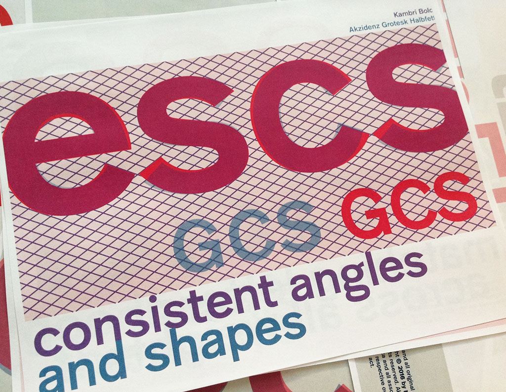
Consistent angles and shapes
One of nice things about Akzidenz Grotesk are the terminals ending at an angle instead of horizontally like Helvetica. Kambri unifies the angle of all terminals, the termination height and point, and the relationship of the letters to each other. Kambri therefore is a lot stricter, starker, more rigid.
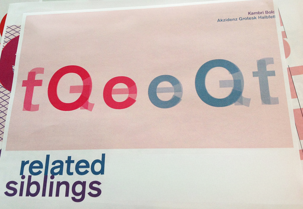
Fully related siblings
All sibling letters (think o, e, c — or G C O, or E, F, H ) have the same basic shape in Kambri. This further unifies the typeface, and purposefully adds to the rigidity and starkness of the face.
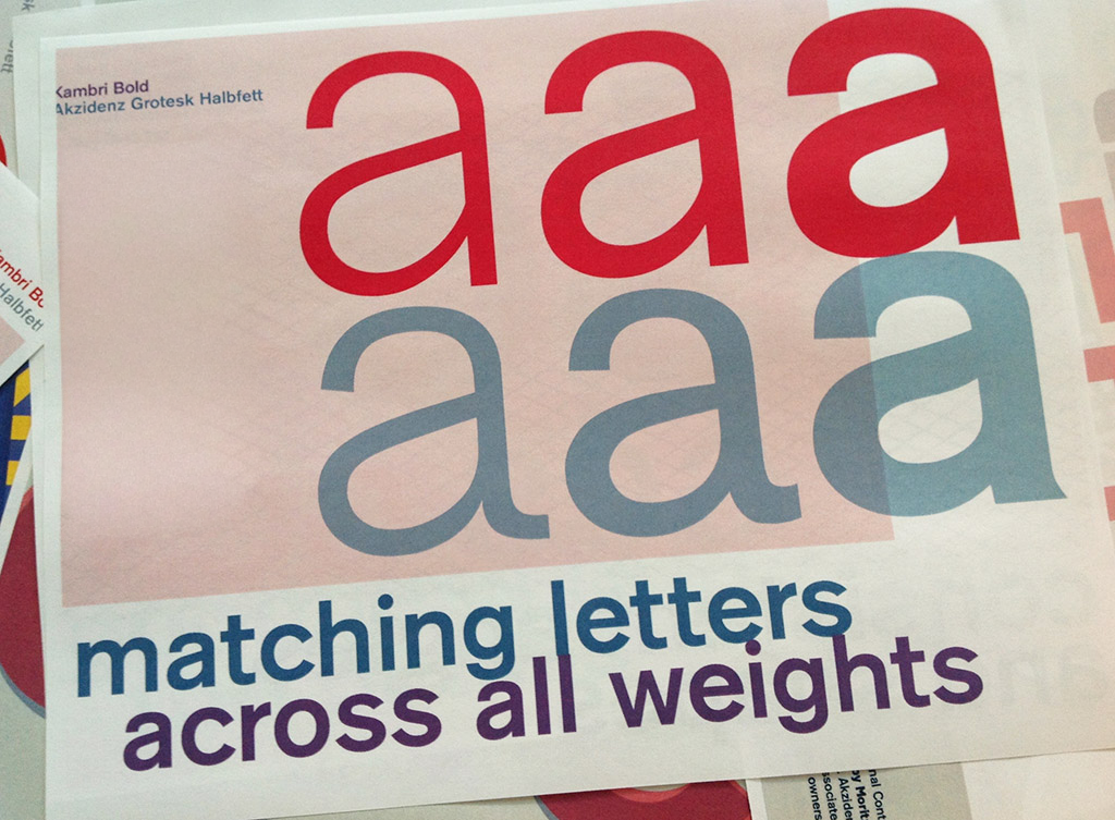
Matching letter shapes across all weights
Kambri has one consistent look and feel across all weights. AG’s various weights were drawn and produced in various different time periods, foundries, designers, and even media, and most digital versions reflect that. With Kambri, every letter is drawn to be the same shape across any weight, for a more uniform, consistent look.
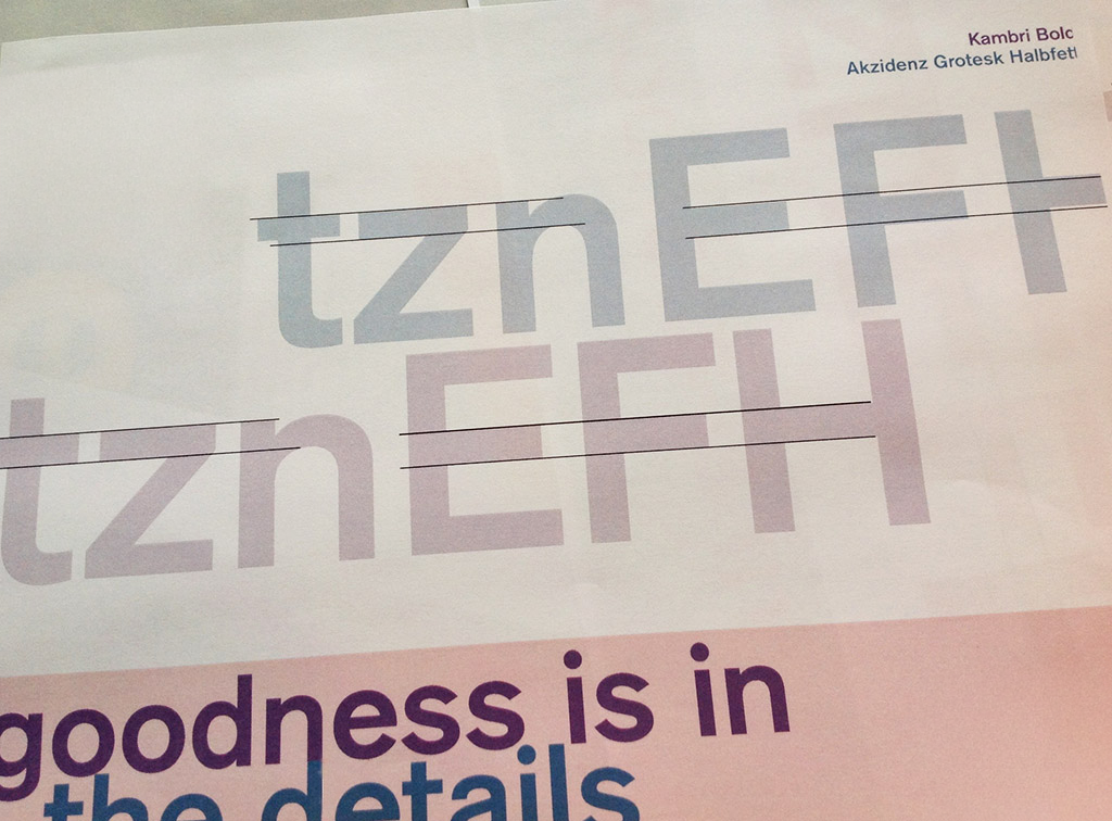
Goodness is in the details
Great care was also taken that all lines are on the same height: the crossbars on the E, F and H, the thickness of the strokes across t, z and f, and the general width of each letter.
Stylistic alternates
Kambri comes with a variety of stylistic alternates, transforming anything from punctuation, individual letters, to the entire look and feel of the font.
Alternate Set 1, meant for small text with added tails, and a more clear differentiation of l and I.
Set 1 thin
96px
normal
la Isla sorna lorem ipsum dolor sit
Set 1 Extra Light
96px
italic
list prices are in high demand
Alternate Set 2 replaces the standard round punctuation with square dots.
Set 2 semi-bold
96px
italic
It’s not: “some”, it’s everyone
Set 2 regular
96px
normal
Wo? „Rüdesheim“, schön in dieser Jahreszeit
Alternate Set 3 reintroduces the single story lowercase g
Set 3 Medium
96px
normal
Giggle cream. It makes dessert funny!
Set 3 Semi Bold
96px
normal
Baggage griding gruntingly down the chute
Alternate Set 4 distinct shapes for lowercase a at different weights, and lengthened ascender of the lowercase t
Set 4 bold
96px
normal
Rattlesnake ridge is where it’s at
Set 4 light
96px
normal
Saltwater grunge is momentous
Alternate Set 5 combines square dots, distinct a, alternate g and t shapes to recreate the closest approximation to Akzidenz Grotesk as a whole
Set 5 semi-bold
96px
normal
It’s stairs to heaven, a power I just can’t deny
Set 5 light
96px
normal
Drag: the only true performance fall for you
Character set
!
!"
“#
#$
$%
%&
&'
‘(
()
)*
*+
+,
,-
–.
./
/0
01
12
23
34
45
56
67
78
89
9:
:;
;<
<=
=>
>?
?@
@A
AB
BC
CD
DE
EF
FG
GH
HI
IJ
JK
KL
LM
MN
NO
OP
PQ
QR
RS
ST
TU
UV
VW
WX
XY
YZ
Z[
[\
\]
]^
^_
_`
`a
ab
bc
cd
de
ef
fg
gh
hi
ij
jk
kl
lm
mn
no
op
pq
qr
rs
st
tu
uv
vw
wx
xy
yz
z{
{|
|}
}~
~¡
¡¢
¢£
£¤
¤¥
¥¦
¦§
§¨
¨©
©ª
ª«
«¬
¨
®¯
¯°
°±
±²
²³
³´
´µ
µ¶
¶·
·¸
¸¹
¹º
º»
»¼
¼½
½¾
¾¿
¿À
ÀÁ
ÁÂ
ÂÃ
ÃÄ
ÄÅ
ÅÆ
ÆÇ
ÇÈ
ÈÉ
ÉÊ
ÊË
ËÌ
ÌÍ
ÍÎ
ÎÏ
ÏÐ
ÐÑ
ÑÒ
ÒÓ
ÓÔ
ÔÕ
ÕÖ
Ö×
×Ø
ØÙ
ÙÚ
ÚÛ
ÛÜ
ÜÝ
ÝÞ
Þß
ßà
àá
áâ
âã
ãä
äå
åæ
æç
çè
èé
éê
êë
ëì
ìí
íî
îï
ïð
ðñ
ñò
òó
óô
ôõ
õö
ö÷
÷ø
øù
ùú
úû
ûü
üý
ýþ
þÿ
ÿĀ
Āā
āĂ
Ăă
ăĄ
Ąą
ąĆ
Ćć
ćČ
Čč
čĎ
ĎĐ
Đđ
đĒ
Ēē
ēĖ
Ėė
ėĘ
Ęę
ęĚ
Ěě
ěĢ
Ģģ
ģĪ
Īī
īĮ
Įį
įı
ıĶ
Ķķ
ķĹ
Ĺĺ
ĺĻ
Ļļ
ļŁ
Łł
łŃ
Ńń
ńŅ
Ņņ
ņŇ
Ňň
ňŌ
Ōō
ōŐ
Őő
őŒ
Œœ
œŔ
Ŕŕ
ŕŖ
Ŗŗ
ŗŘ
Řř
řŚ
Śś
śŞ
Şş
şŢ
Ţţ
ţŤ
ŤŦ
Ŧŧ
ŧŪ
Ūū
ūŮ
Ůů
ůŰ
Űű
űŲ
Ųų
ųŴ
Ŵŵ
ŵŶ
Ŷŷ
ŷŸ
ŸŹ
Źź
źŻ
Żż
żƒ
ƒˆ
ˆˇ
ˇ˘
˘˙
˙˚
˚˛
˛˜
˜˝
˝̀
̀́
́̂
̂̃
̃̄
̄̇
̇̈
̈̊
̊̋
̋̌
̌̒
̦̒
̧̦
̧̨
̵̨
̵̷
̷̸
̸Δ
ΔΩ
Ωμ
μπ
πẀ
Ẁẁ
ẁẂ
Ẃẃ
ẃẄ
Ẅẅ
ẅỲ
Ỳỳ
ỳ–
–—
—‘
‘’
’‚
‚“
“”
”„
„†
†‡
‡•
•…
…‰
‰‹
‹›
›⁄
⁄€
€™
™