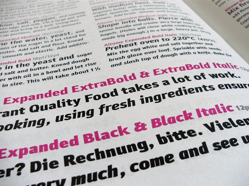
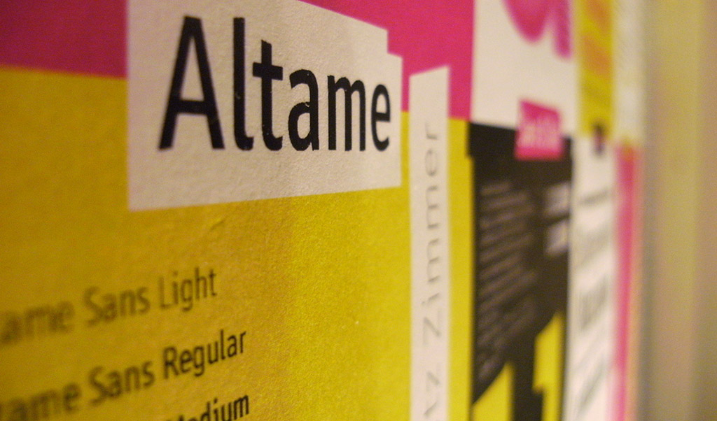
Altame family
Neapolitan blazers with elbow patches dominate hashtag-menswear Tumblr. Single-origin craft coffee shop authors. And Slab Serifs are everywhere. Altame (all-tah-may) is the typeface that feels like this time—something you see think: That’s so 2010s.
Altame Serif
Hairline
48px
normal
The quick brown fox jumps over the lazy dog
Light
48px
italic
Waltz, bad nymph, for quick jigs vex.
Regular
48px
normal
Jackdaws love my big sphinx of quartz
Regular
48px
normal
You complete me in more ways than one
Extra Bold
48px
italic
It’s a dilution for higher end restaurants
Altame Sans
Extra Bold
48px
normal
That they should not be left alone
Bold
48px
normal
Vangelis quäkt: Grüß Felix bzw. Jody schön!
Regular
48px
italic
Victoria und Marx quälten sich in heißer Zypernsonne bis zur Küste
Light
48px
normal
Glib jocks quiz nymph to vex dwarf
Hairline
48px
normal
Something that you said, turned me from the inside out
Altame Serif
Altame Sans
Hairline
96px
normal
The quick brown fox jumps over the lazy dog
Extra Bold
96px
Italic
That they should not be left alone
Light
96px
italic
Waltz, bad nymph, for quick jigs vex.
Bold
96px
normal
Vangelis quäkt: Grüß Felix bzw. Jody schön!
Regular
96px
normal
Jackdaws love my big sphinx of quartz
Regular
96px
Normal
Victoria und Marx quälten sich in heißer Zypernsonne bis zur Küste
Bold
96px
normal
You complete me in more ways than one
Light
96px
normal
Glib jocks quiz nymph to vex dwarf
Extra Bold
96px
italic
Boxkämpfer jagt zwölf Schoßhunde quer über Sylt
Hairline
96px
italic
Something that you said, turned me from the inside out
Altame Sans Display
Altame Sans has a striking display variant, which really shines in the higher weights. Most ‘tails’ are removed, and the whole font is stiffened and tightened.
Black
48px
normal
Now it’s more than a game, feel the sun on your face
Bold
48px
normal
Something that you said, turned me from the inside out
Regular
48px
normal
Jackdaws love my big sphinx of quartz
Light
48px
italic
Waltz, bad nymph, for quick jigs vex.
Hairline
48px
normal
The quick brown fox jumps over the lazy dog
Black
128px
normal
Now it’s more than a game, feel the sun on your face
Bold
128px
normal
Something that you said, turned me from the inside out
Regular
128px
normal
Jackdaws love my big sphinx of quartz
Light
128px
italic
Waltz, bad nymph, for quick jigs vex.
Hairline
128px
normal
The quick brown fox jumps over the lazy dog

Character set
!
!"
“#
#$
$%
%&
&'
‘(
()
)*
*+
+,
,-
–.
./
/0
01
12
23
34
45
56
67
78
89
9:
:;
;<
<=
=>
>?
?@
@A
AB
BC
CD
DE
EF
FG
GH
HI
IJ
JK
KL
LM
MN
NO
OP
PQ
QR
RS
ST
TU
UV
VW
WX
XY
YZ
Z[
[\
\]
]^
^_
_`
`a
ab
bc
cd
de
ef
fg
gh
hi
ij
jk
kl
lm
mn
no
op
pq
qr
rs
st
tu
uv
vw
wx
xy
yz
z{
{|
|}
}~
~¡
¡¢
¢£
£¤
¤¥
¥¦
¦§
§¨
¨©
©ª
ª«
«¬
¨
®¯
¯°
°±
±²
²³
³´
´¶
¶·
·¸
¸¹
¹º
º»
»¼
¼½
½¾
¾¿
¿À
ÀÁ
ÁÂ
ÂÃ
ÃÄ
ÄÅ
ÅÆ
ÆÇ
ÇÈ
ÈÉ
ÉÊ
ÊË
ËÌ
ÌÍ
ÍÎ
ÎÏ
ÏÐ
ÐÑ
ÑÒ
ÒÓ
ÓÔ
ÔÕ
ÕÖ
Ö×
×Ø
ØÙ
ÙÚ
ÚÛ
ÛÜ
ÜÝ
ÝÞ
Þß
ßà
àá
áâ
âã
ãä
äå
åæ
æç
çè
èé
éê
êë
ëì
ìí
íî
îï
ïð
ðñ
ñò
òó
óô
ôõ
õö
ö÷
÷ø
øù
ùú
úû
ûü
üý
ýþ
þÿ
ÿĀ
Āā
āĂ
Ăă
ăĄ
Ąą
ąĆ
Ćć
ćĊ
Ċċ
ċČ
Čč
čĎ
Ďď
ďĐ
Đđ
đĒ
Ēē
ēĖ
Ėė
ėĘ
Ęę
ęĚ
Ěě
ěĞ
Ğğ
ğĠ
Ġġ
ġĢ
Ģģ
ģĦ
Ħħ
ħĪ
Īī
īĮ
Įį
įİ
İı
ıĶ
Ķķ
ķĹ
Ĺĺ
ĺĻ
Ļļ
ļĽ
Ľľ
ľŁ
Łł
łŃ
Ńń
ńŅ
Ņņ
ņŇ
Ňň
ňŊ
Ŋŋ
ŋŌ
Ōō
ōŐ
Őő
őŒ
Œœ
œŔ
Ŕŕ
ŕŖ
Ŗŗ
ŗŘ
Řř
řŚ
Śś
śŞ
Şş
şŠ
Šš
šŢ
Ţţ
ţŤ
Ťť
ťŦ
Ŧŧ
ŧŪ
Ūū
ūŮ
Ůů
ůŰ
Űű
űŲ
Ųų
ųŴ
Ŵŵ
ŵŶ
Ŷŷ
ŷŸ
ŸŹ
Źź
źŻ
Żż
żŽ
Žž
žƒ
ƒȘ
Șș
șȚ
Țț
țˆ
ˆˇ
ˇ˘
˘˙
˙˚
˚˛
˛˜
˜˝
˝̀
̀́
́̂
̂̃
̃̄
̄̆
̆̇
̇̈
̈̊
̊̋
̋̌
̌̒
̦̒
̧̦
̧̨
̵̨
̵̶
̶̷
̷̸
̸Δ
ΔΩ
Ωμ
μπ
πẀ
Ẁẁ
ẁẂ
Ẃẃ
ẃẄ
Ẅẅ
ẅẞ
ẞỲ
Ỳỳ
ỳ–
–—
—‘
‘’
’‚
‚“
“”
”„
„†
†‡
‡•
•…
…‰
‰‹
‹›
›⁄
⁄€
€™
™⅐
⅐⅑
⅑⅒
⅒⅓
⅓⅔
⅔⅕
⅕⅖
⅖⅗
⅗⅘
⅘⅙
⅙⅚
⅚⅛
⅛⅜
⅜⅝
⅝⅞
⅞⅟
⅟↉
↉←
←↑
↑→
→↓
↓↔
↔∂
∂∅
∅∏
∏∑
∑−
−√
√∞
∞∫
∫≈
≈≠
≠≤
≤≥
≥◊
◊◼
◼fi
fifl
flffi
ffiffl
ffl